The Hidden Value of Magic (and Tailwind CSS)

As I’ve begun the full rewrite process of my Slipmat.io hobby project, I’m astounded how much I’ve been learning from all kinds of things every step of the way, by carefully analysing the old, and making lots of effort in engineering and designing the new. What follows is one of my latest learned lessons that connected some dots between 15 years of working with the Web.

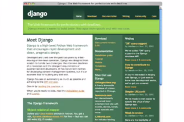
Python is my favourite programming language, and I’ve always stayed firmly with the Django camp as opposed to Flask or any other gazillion alternatives. In the early days of Django (like 15 years ago) I also had lots of reservations against Rails, mostly because I was young and stupid, but also because it had too much magic. The more I’ve worked with JavaScript the more I’ve learned about good architecture and best practises from bad examples, and my views on magic have changed somewhat.

JavaScript is a fascinating language. ECMAscript 2020 is the ultimate lipstick on a pig. The core language is such an awful mess, yet the new syntax is pretty powerful and the modern tooling built around it is truly amazing and wonderful to work with. And as the tools have gotten so much better in a very rapid pace, the community is starting to get the libraries and coding conventions in a better shape as well.

Vue 3 is a great example of this. It’s built totally from ground up using TypeScript, designed with an open RFC process taking feedback from the whole community, and Evan You has done a lot of work shaping the end result into something that’s actually designed to be used and not only something that looks good.

The work on my new Vue 3 project template has advanced to list screens which need various list components, preferably in a form of a powerful datatable component. I had to completely drop the project for a while to get a better understanding what I’d really want here. Today I finally had an epiphany; the thing that’s most wrong in the current Slipmat design are the numerous different random third-party components that even though styled to look somewhat (but not exactly) similar, they all feel different. And this exactly is my issue with glue-in frameworks like Flask as well. Even though the various parts can be easily used together, there’s always something missing compared to tools like Django where everything is built to work together.

So now we get dangerously close to the infamous not invented here syndrome. If gluing up various third-party solutions yields bad results, then surely we should write all components ourselves? Well, no. Firstly, always prefer an existing ui library (like Vuetify for Vue/Material Design) over building anything yourself. Secondly, –and this is again something I realised today– properly architectured third-party components can be not just almost but precisely tweaked to fit your design. And whenever using them, you should take the time to do that design work properly. The main problem with inconsistent Web UIs is handwritten CSS. Whenever a non-designer needs to invent their own styles, the end result will end up looking something that almost matches the thing they did yesterday, but only almost. And this is where Tailwind CSS shows again how brilliant the utility-first idea really is; there is close to zero handwritten css needed for most Tailwind projects which automatically restricts you to a relatively small amount of professionally curated choices. The end result looks automatically not-very-bad and with some tweaking it’s not hard to get absolutely spot-on. (To be fair, it’s not easy either, but unlike trying to manually come up with CSS, it’s way easier!)

After I watched Adam Wathan build this select component, I was convinced that this would be the way I should build the few components (button, toggle-switch, modal, toast, data table / list component, datepicker, tag input) I need for the Slipmat rewrite.

(Yes. NIH. I’d love to use some third-party library here but at the moment there just aren’t too much to choose from for Vue 3 and Tailwind.)

Datatable experiment

The first iterations don’t need to be anything too fancy so I’m confident that building all of these from scratch instead of trying to modify third-party alternatives won’t be an issue. I’m also fully prepared to switch to using @tailwindui/vue or some other library in the future if maintaining these eats too much time. Just to get a feeling of what the API would maybe feel like I created an experiment project and pushed it to GitHub (not GitLab because on GH I get Dependabot updates automatically).

So this story has been a bit of a rambling journey from back in the early days of Web frameworks to Vue 3 and Tailwind CSS. What I’m finding common between all these projects is the meticulous attention to detail regarding almost every aspect of the tool, especially to API design. Great tools aren’t born by accident, they are engineered. And after working with JavaScript for few years now I’m starting to appreciate the metaprogramming powers of Python which makes it possible to write super clean —and somewhat magical— APIs. A good amount of magic really makes a difference in developer experience when it’s done right. I still do think that having a pluralization engine that automatically fetches one Octopus and many Octopi is way too much but I also do appreciate the attention to detail in Rails the more I get to see language restricted not-so-beautiful designs in JavaScript land.

So the lesson of the day: invest in API design and the most value from magic comes from those situations where you can’t see it.

How Real Life Data Can Kill An Idea

I had an idea to add tweets from registered DJs to the site homepage to give it more fresh and dynamic feel. So I hacked together a small script that fetched latest tweets from all of the DJs using Twitter API. After taking a quick look of the data, it was quite obvious that in practise, this wouldn’t be a very good addition to the homepage.

This is what I saw:

Database Screenshot of Tweets

When you think about it, it makes sense. Most DJs aren’t really interested in Twitter or other social media (except sites like SoundCloud and Mixcloud, which in contrast are very important and much used), they just feel that they need to be there because everyone else is and promoting yourself is hard. Their tweets are mostly just plain adverts of upcoming gigs and very little actual content. DJs create their content as music, not as tweets.

This is actually a good example why it’s important to have deep understanding of the field in order to being able to create good services for it. I’m not yet very familiar with the whole DJ scene yet, which is why I often ask dumb questions from experienced DJs who have been in the business for decades. But I’m learning every day.

(This post was originally posted to my other blog called Spinning Code.)

Django UI in 2005 vs Django UI in 2014

I stumbled across my favourite ever tech talk, the legendary Snakes and Rubies event where Django met Rails, back in 2005. One thing caught my eye while re-watching every minute of the 3-hour event: the Django Web site and the Admin Site app look almost exactly the same today than they did 9 years ago.

Screen capture image from Djangoproject.com as it was in 2005

Still image of Djangoproject.com from the Snakes and Rubies video, 2005.


Screen Shot 2014-09-17 at 22.50.28

Djangoproject.com, 2014.


Still image from Snakes and Rubies video

Still image of Django Admin Site from the Snakes and Rubies video, 2005.


Screen Shot 2014-09-17 at 22.58.44

A screencapture of one Django Admin app (in Finnish — it still talks also Welsh, among others), 2014.


I don’t want to comment this in any other way but to notice that it’s quite amazing that Djangoproject.com still looks so good and I actually like using it every single day — it works really well. Way better than most newer homepages of other open source projects.

Granted, the Admin app looks a bit more dated, but not too much. And for its purpose, it too works still really well.

Wilson Miner is one kick-ass designer.

And Wilson, it’s not just a Web site. 🙂

(This post was originally published on my other blog called Spinning Code.)

Design Your URLs

URLs are the most important, and yet often least designed, part of your website. No matter if it’s a cool 2.0 application or plain vanilla homepage, it’s the URLs that lead the visitors to it. Why is it that almost nobody seem to know (or care about) how to design them?

Any web developer should know that URIs are a part of the sites user interface. Usability guru Jakob Nielsen reminded us about this back in 1999, but very few of us seem to remember.

Learning from bad examples

Here’s a typical example of a very bad URL:

http://www.turunsanomat.fi/viimeuutiset/ts/?ts=0,3:2025:0:0,4:26:0:0:0;4:27:0:0:0;4:28:0:0:0;4:29:0:0:0;4:30:0:0:0;4:31:0:1:2007-01-06;4:35:0:0:0,0,1:0:0:0:0:0:#429985

This is so ugly that it’s impossible to say anything good about it. It makes me want to cry.

Apple usually gets things like these right. Apple.com is generally very good regarding to URLs, but then there is the Apple Store. I’ll buy you a beer if you can read this to your grandma over the phone:

http://store.apple.com/Apple/WebObjects/fistore.woa/6994044/wa/PSLID?mco=E2DBC1A0&nclm=iPod&wosid=ci7FXn07nrcd2jXw2kj1tYj6QqG

Do you know where it points to? Of course not. But guess what’s the best part of it? It doesn’t work. Try it yourself.

As an example of a half-way designed URL, lets look at

http://shop.digitalworldtokyo.com/index.php/shop/product/full_set_of_three_usb_humping_dogs/

This is a good example of an URL as UI. You may not want to visit that page after seeing the URL. But this is not a good URL. First, why on earth is there an /index.php/ in the middle, even though it most definitely could have been omitted?

Also, the word ‘shop’ occurs twice in the URL. And ‘product’ is not useful here in any way, so why display it? Instead there could be some category reference in the URL so that products in different categories would be distinguishable.

With these tweaks a good URL for this product could be something like:

http://shop.digitalworldtokyo.com/usb/full_set_of_three_usb_humping_dogs/

How to design good URLs

There are many preferences of how to build a good URL structure. The most important thing is to be consistent. The small details are not as important as that they are consistent as a whole.

Often the URL structure of a companys web site is similar to the inner structure of the company. This is a very basic mistake that you should avoid. While it may be quite easy for you to understand the inners of your company, it’s not something that your customer knows, or even should know. Try to be as descriptive and simple as you can when designing the URLs.

A good URL:

  • is short
  • gives user a hint about the content (ie. use /products/product_name/ instead of /c/1/)
  • tells user where he/she is (ie. /support/product_name/faq/)
  • is hackable (ie. if faq is at /support/product_name/faq/, then /support/product_name/ shows the support main page for this product and /support/ is the main support page. Also, if you search faq for product2, you should find it at /support/product2_name/faq/)
  • does not have any session data or other cruft in it
  • does not expose the underlying technology (like foo.php and bar.aspx does)

How to redesign URLs

While Cool URIs don’t change, it’s inevitable that sometimes you have to change something. As a matter a fact, in my opinion, you should change the URLs as your organization changes. But when you do, you should do it very wisely.

Here are some tips:

  • Avoid linkrot with any means necessary. With every changed URL, redirect the old URL permanently (using HTTP status code 301) to the new one. Automate the process if you can.
  • Just in case, use a good 404 page that informs users about recent site redesigns, so that in case of a missed redirect, they can locate the moved page easily.
  • Design to future. Try to avoid situations where you have to change URL designs more often than yearly.
  • Use temporary redirects. For example, when designing a campaign site for spring 2007, you can use /spring_campaign/ or similar as the URL for marketing, and redirect the page temporarily (with HTTP status code 302) to /spring_campaign/2007/. Next year, just change the redirect to /spring_campaign/2008/. This way, when someone links to the campaign page, they’ll probably link to the right permanent URL and you can still use short and easy to remember URLs in marketing.
  • If, for whatever reason, you absolutely must delete a page, inform users about it on the 404 page. If possible, offer them a way to go to some other relevant page.

Require good URLs

Good URLs don’t just happen — you have to design them. Next time when listening to someone pitch about website design, publishing platform or developing framework, ask the person “what about the URLs”. Remember that the question is very much like “is she pregnant”, because it’s not possible to have a little bit customized URLs (well, it is, but it’s pointless) no more than it’s possible to be a little bit pregnant.

In web design, you can cut the corners in many places, but don’t do it with URLs.